Blog
Introducing our Data Visualization Fellow Marie Cecil ’24
Hello everyone! My name is Marie Cecil, and I am the Data Visualization Fellow at the Shi Institute this academic year. I work with Director of Applied Sustainability Research Mike Winiski and Jack Buehner and Zury Marroquin, both Post-Baccalaureate Fellows. My role in this position is to assist with projects and learn new data visualizations methods and best practices.
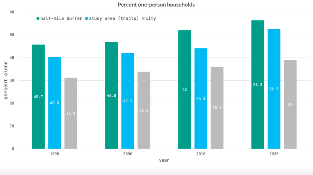
Currently, I’m creating a style guide for data visualization practices at the Shi Institute. Using graphs, charts and maps made for a local organization in Greenville, I have been documenting styles for the Shi Institute’s future data visualization projects. This local organization in Greenville has been documenting trends in how food systems relate to population demographic and household size. The graphs, created by Jack Buehner and Mike Winiski, illustrate how race and household size impact food systems. In this specific case, the demographic of the area surrounding a Piggly Wiggly that recently closed down illustrates future work needing to be done in food security.

I also learn about the many different types of data visualization techniques. I work primarily with coding and creating graphs as a means of learning at the Shi Institute. In the fall, I learned how to work with HTML, CSS and Javascript coding to visualize data. Being able to work with different types of code has allowed me to understand the best practices for the style guide I am creating this spring!
This fellowship carries much importance for sustainability. Data visualization is crucial when communicating data, especially sustainability data, to audiences. Being able to be a part of the commitment to creating easily discernible and eye-catching charts and graphs for audiences is important to me too. There are many behind-the-scenes actions that must be done before producing a map, chart or graph to audiences who share a commitment to sustainability, and I am very fortunate to be part of the process!
 This fellowship helps play a part into the bigger picture of sustainability. I have had the opportunity to watch the Applied Sustainability Research teamwork and collaborate with many different organizations in the Upstate, and at Furman. So, the next time you’re attending a talk, or reading an article on sustainability, take a moment to consider where that graph came from, and the work done to make it visualize such important data in sustainability.